brand refresh
we redesigned our brand, and taught it how to think
00

problem
We had built a creative platform — "Engineered for Ambition" — but it was mostly just living in the tagline, not in the work (yet). In practice, it meant visuals going from cinematic photography, followed by dense data diagrams. Emotional storytelling, then a wall of technical copy. The jump between theser could be jarring. And with our strategy laser-focused on winning the world's largest enterprises, we couldn't afford a brand that lost people halfway through the conversation
solution
We turned a concept into a system. Not a just new logo, or a new color palette, but a strategy and a framework that tells every designer, writer, and regional team exactly what to create depending on where a buyer is in their journey. Inspire, explain, show, prove. Each with its own visual language, tone, and job to do. The result is a brand that can hold a C-suite's attention and close a developer in the same campaign. The results weren't in a brand tracker or dashboard. But they were showing up in how are people are working everywhere. Teams shipping faster, with less back-and-forth about what assets should look like. Regional markets working from the same visual logic. Briefings getting sharper. External agencies spending less time in feedback loops and more time actually making things. A system with clear intention, not one that needs policing.
It's important to keep things that are working, and improve the things that don't. And the brand was good. The problem was that there wasn't always consensus on what that meant in practice.
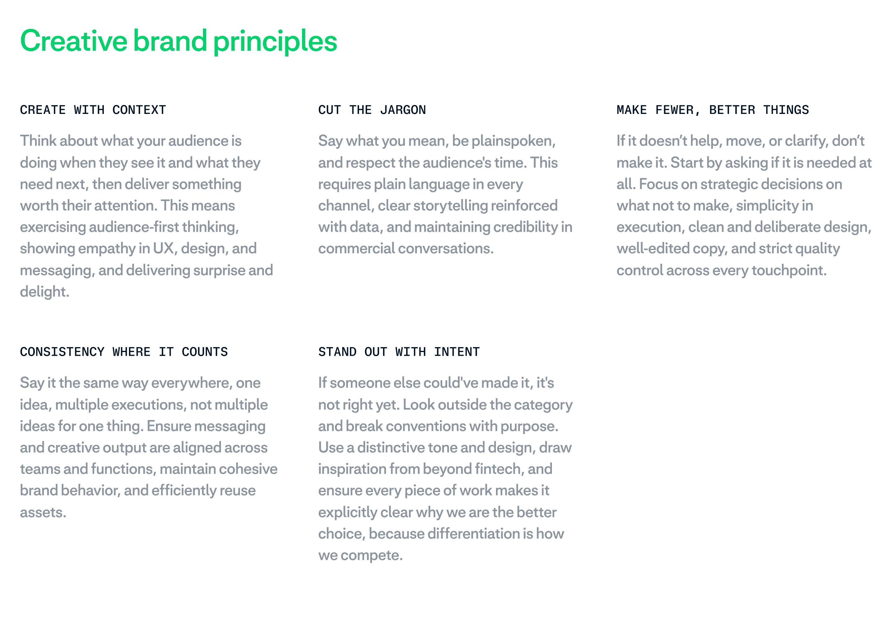
A designer in Amsterdam and a copywriter in New York might have been both working "on brand" and producing different things. Not because they were careless, but because the brand gave them a vibe, not a behavior. We turned abstract ideals into actionable principles. Cut the jargon. Create with context. Make fewer, better things. If a piece of work couldn't pass those filters, it wasn't done yet.
The visual system came from the same logic. "Engineered for Ambition" is a duality that we build on strategically in our Creative platform: precision and humanity, structure and warmth. So we built a visual language that actually carries both. Adyen Mono and strict grids for the technical proof points. Adyen Sans and cinematic photography for the human story. And in between, a new illustration style that bridges the two, engineered shapes with a tactile, human grain. A way to show and explain the digital concepts that aren't always able to explain in photography or copy, it was the visual glue we were missing.
The most underrated part of the project is the 4-stage framework. When we were building this, it became apparent that it's essential that the people using this need to know when to use what. Inspire. Explain. Show. Prove. Every asset has a job now. That sounds obvious, but it wasn't how we were working before. People were designing in a vacuum, picking a visual style based on personal taste rather than strategic intent. Now the question is always: what is this asset supposed to do? And the system will help you pick the right visuals.
It unlocked consistency, but even more so, was speed. Teams stopped second-guessing and started shipping.
year
2025
category
Brand identity
▶ VIDEO
01

02

03

04

05

06

07

08

09

010

011

012

013